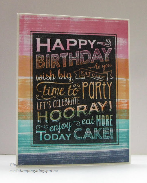
Last week I made a couple white and black birthday cards but wasn't 100% happy about it especially the white one. So I decide to jazz it up a little.
For the black one, it has already a very good contrast, so I just added an outline to give it a more finished look, but didn't make a drastic change.
For the white one, I used Copic markers to darken the sentiment to make it more visible, and I cut the center image out and mount it back with foam adhesive to give it a 3D effect. Unfortunately it is not showing up very much on the photo.
Here's individual shots of the improved version.
Thanks for visiting, I wish you a lovely day!!


1 comment:
Wow, I am blown away by the designs!! These are AWESOME, Cindy! The look is so modern and fun! I absolutely love this!
Post a Comment